M365
Visual + Brand DesignMicrosoft commisioned Cinco to help create a visual system for digital platforms around the launch of their new central hub, M365. My team and I worked with 3D artist Travis Ragsdale to create a series of art that spoke to the immersive features of M365 on both a brand and platform level.
My role was to help craft briefs for Travis based on greater overarching concepts we developed as a team, i.e. "creative flow, "interconnectedness" and "symphony." This was my first experience working with 3D art, and I learned a lot about the process and language needed to effectively provide direction in the z-space.
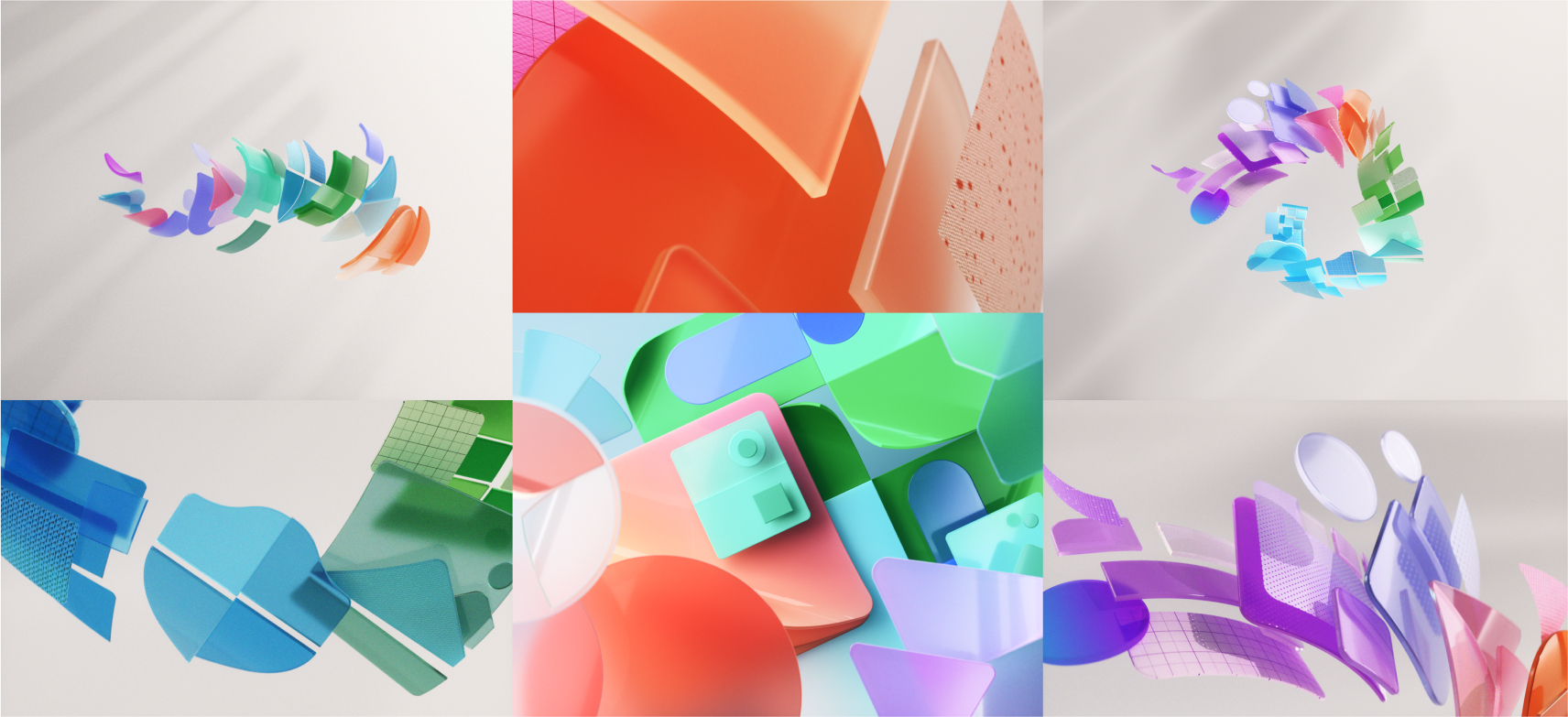
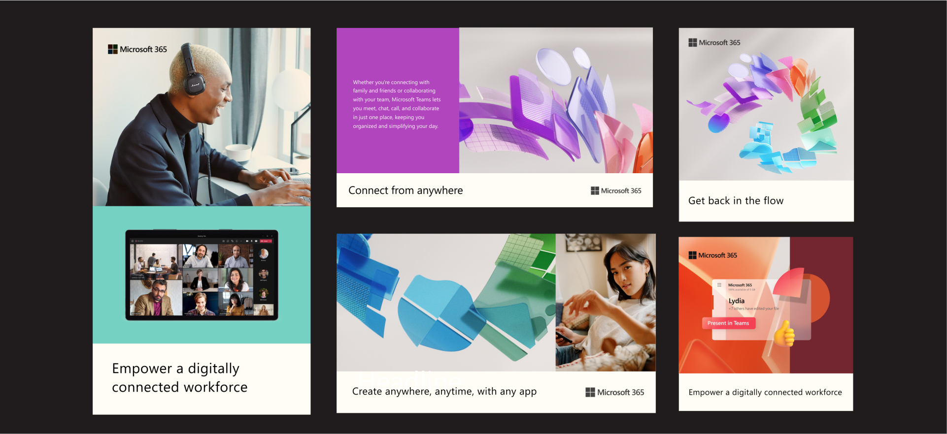
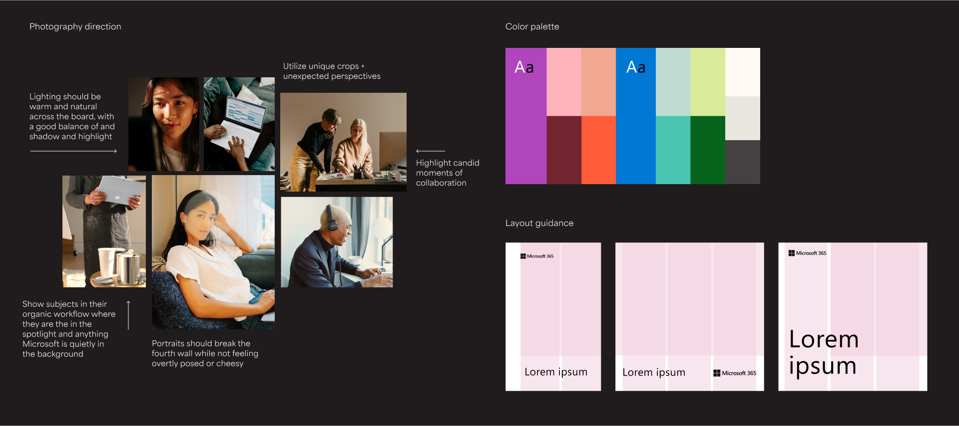
As the team’s brand designer, I was responsible for providing detailed and concise direction throughout the system, really getting into the nitty gritty of each element and how to use them.
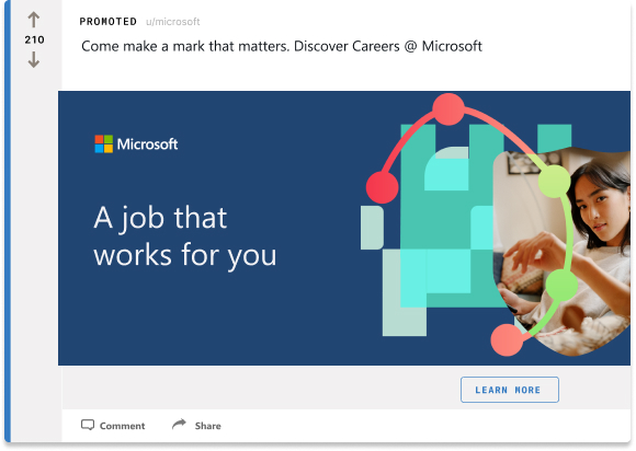
Microsoft Global Talent
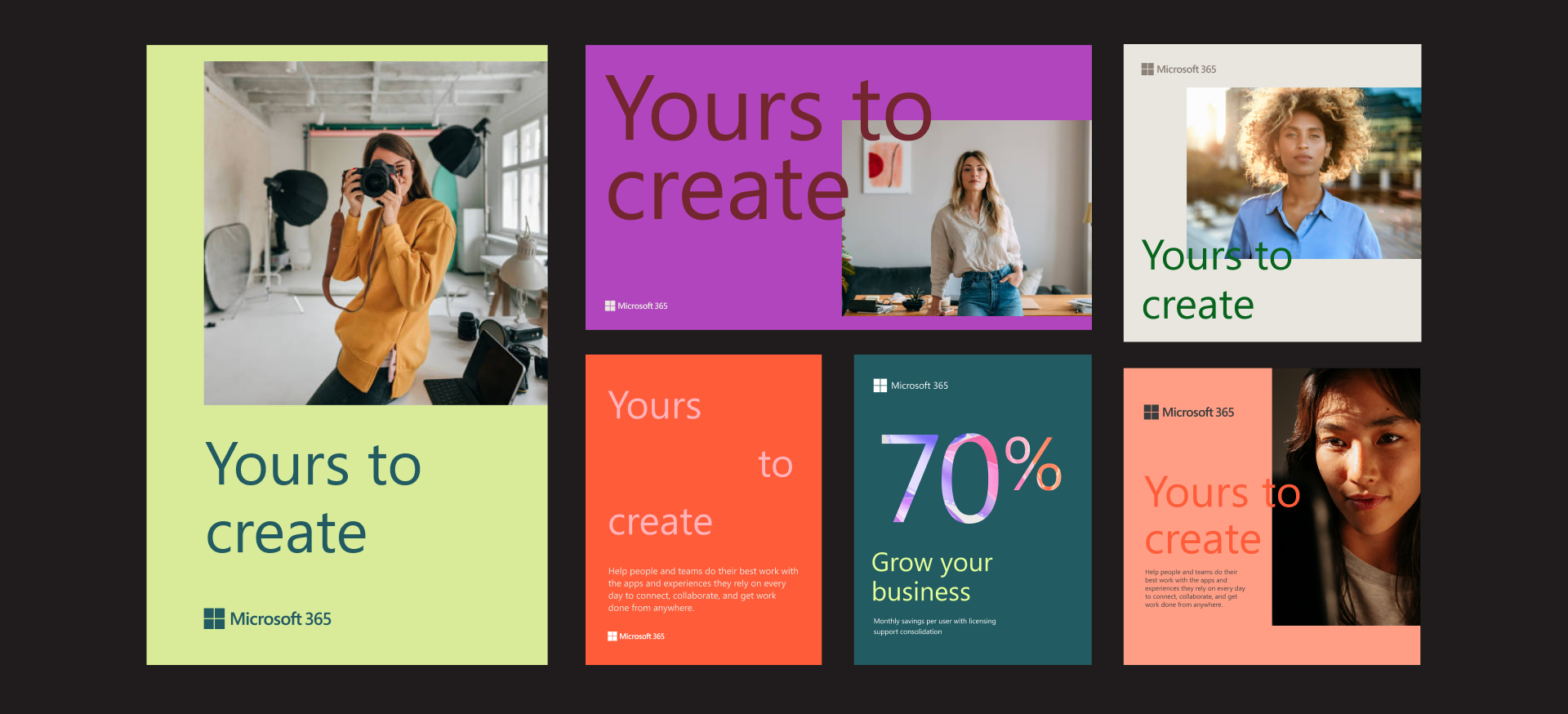
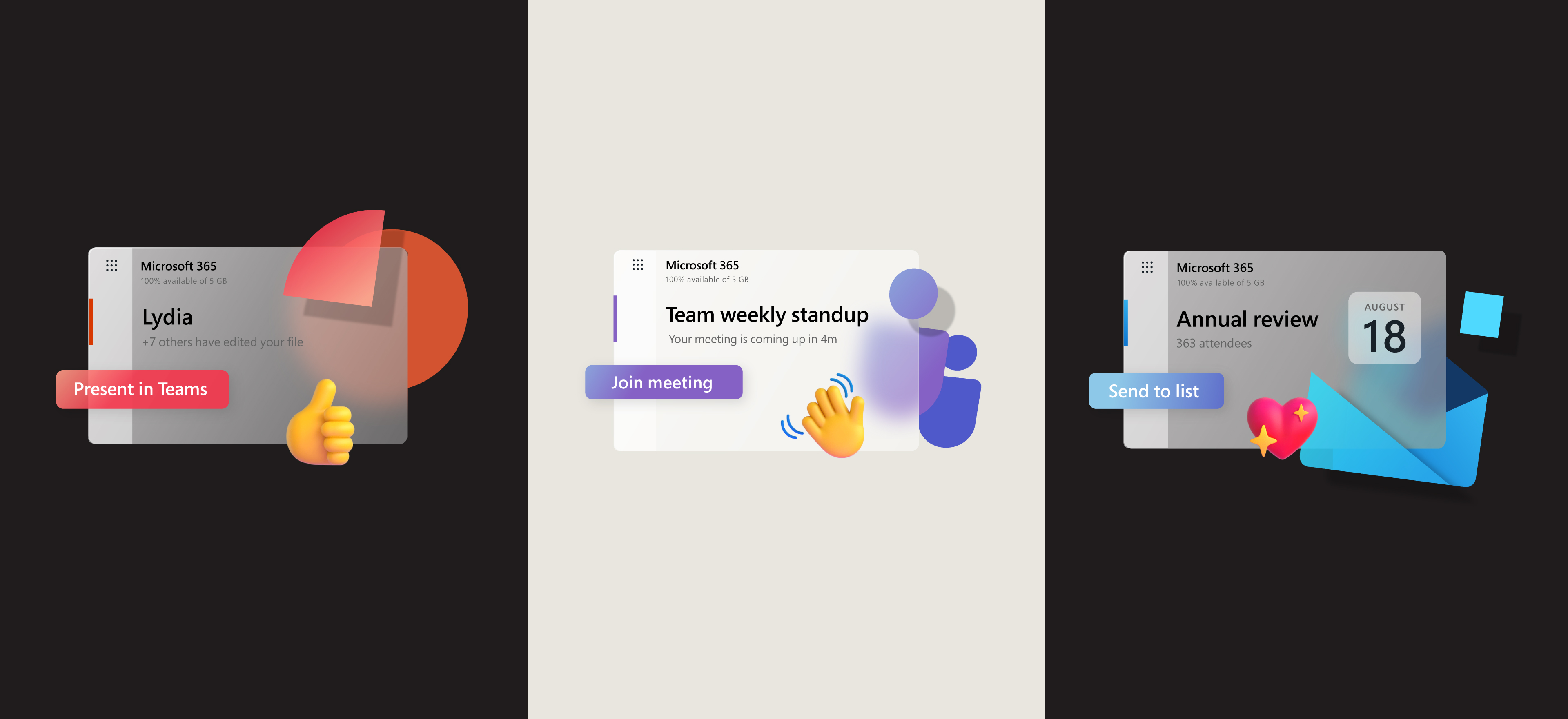
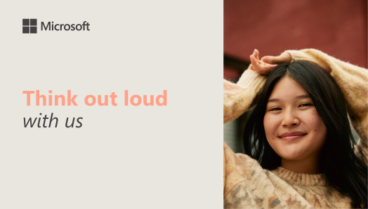
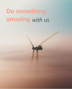
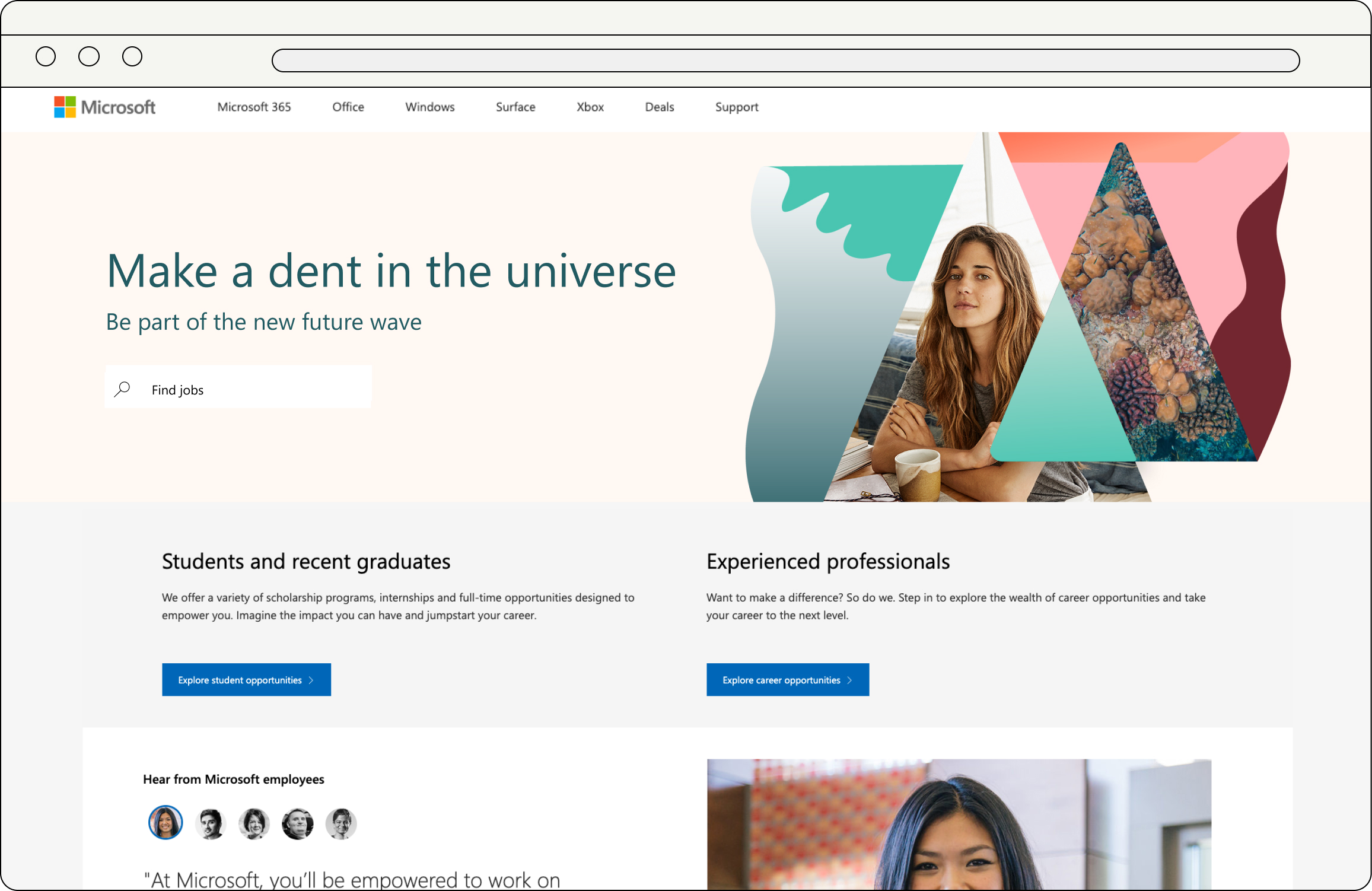
Visual + Brand DesignMicrosoft’s Global Talent Acquisition team hired Cinco to develop a collection of digital visual systems to test across various regions and channels. We made six fully fleshed out systems in total, and the following are two systems that I owned.
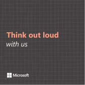
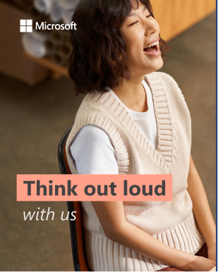
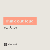
CAMPAIGN A:

This concept was intended for the young professional with big goals, ideas and aspirations. Since I knew the second (B) campaign would be more centered around values and would lean heaviliy on illustration, I wanted this direction to feel distinctly more contemporary and human-centric.


System expanded.
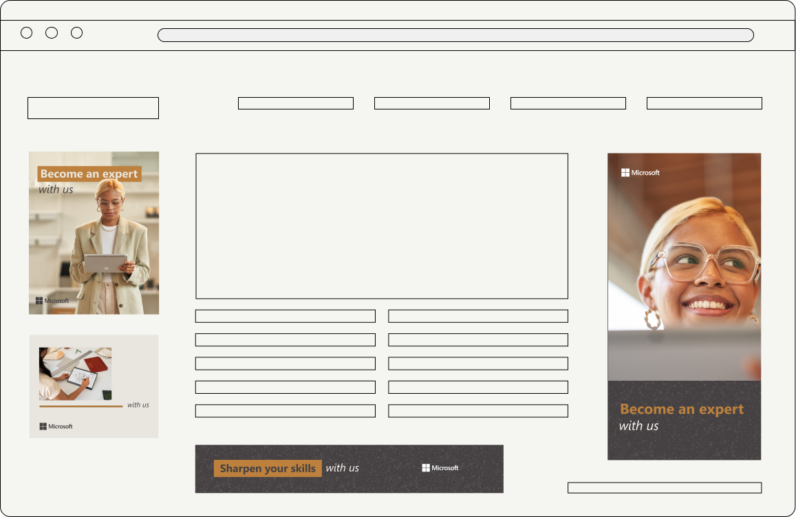 Banner ads.
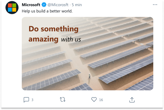

Social ads.
CAMPAIGN B:
With the goal of creating a second campaign that felt distinct from the first, this system was built upon four value pillars used internally by Microsoft; commitment to growth, sustainability, stronger together and trust in technology.The GTA team wanted to explore the idea of the sum being greater than the parts, and were curious what this could look like through an illustrative lens.

Web banner.
Building upon the four value pillars, I created a piece of simple key art for each that was then used to build out the rest of the system’s style cues. These illustrations are comprised of abstract geometric shapes that are imperfect but flexible, giving them a friendly and humanist feel.
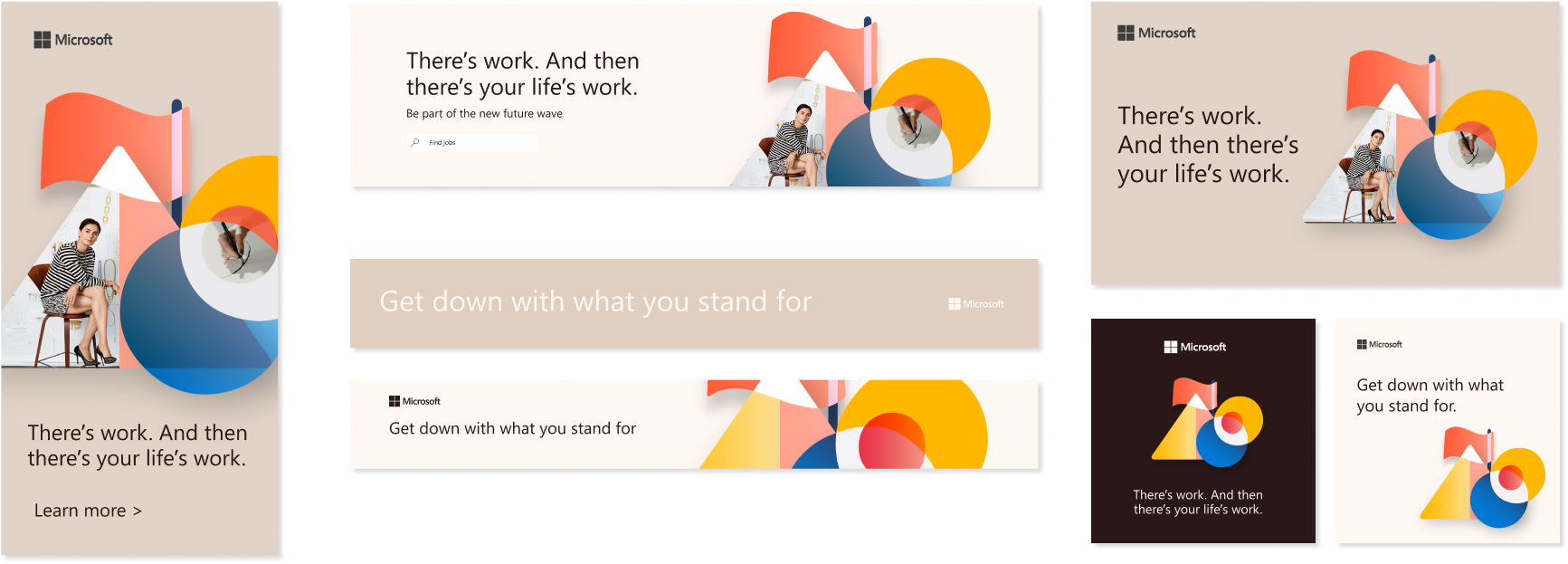
“Stronger Together” pillar expanded.